18 Botanical Fabric Dye Patterns and Color Ideas
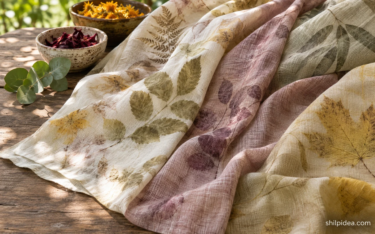
Botanical fabric dye projects begin with a small decision about color, placement, or pattern. A swatch lets you see whether you like the result before trying anything larger.
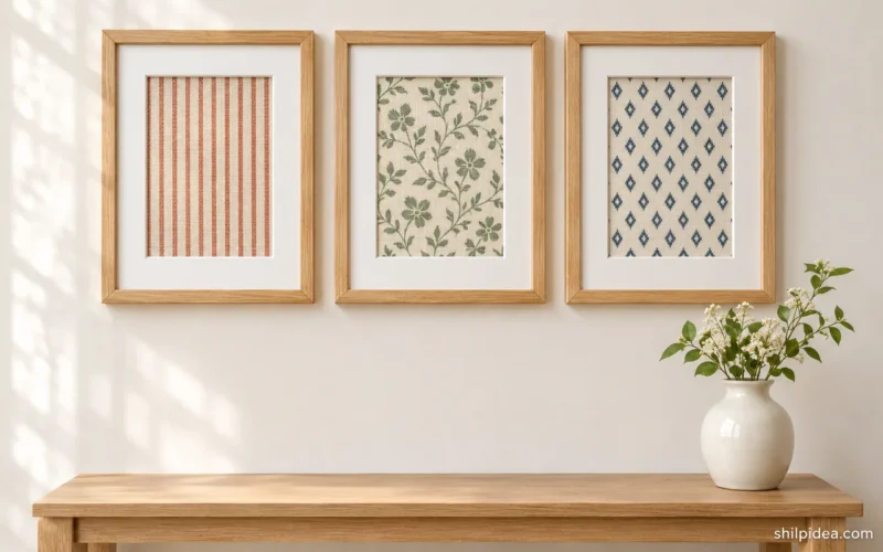
Compare dried samples under the light where you plan to use the textile. A quiet pair of colors works well for framed fabric art.
The examples below include blue folds, warm onion-skin tones, and samples arranged to show color changes. Compare the soft floral shades with a dried flower centerpiece if you want both pieces in the same room.
1. Keep a Mottled Blue Cloth as the Focal Point

A mottled blue cloth already has enough variation to read from a distance. Hang a small section near plain wood or white pottery so the lighter creases stay visible. Before making a larger version, label one swatch with the cloth and method so you can repeat the look if it works.
2. Set Soft and Strong Colors Side by Side

Arrange samples from the palest color to the strongest and decide whether the full range fits the piece you have in mind. A few distinctly different tones are easier to compare once the pieces are dry. Pin them onto white card and check them under the light where they will be used.
3. Let Yellow Collect Around the Folds

Look for a yellow sample with light and dark areas instead of a perfectly flat finish. Stretch the finished sample against a light background so you can judge where the creases will show after pressing. Try a small decorative square first and keep it away from strong sunlight if you want to preserve the color.
4. Break Up a Yellow Dye Pattern with Pale Lines
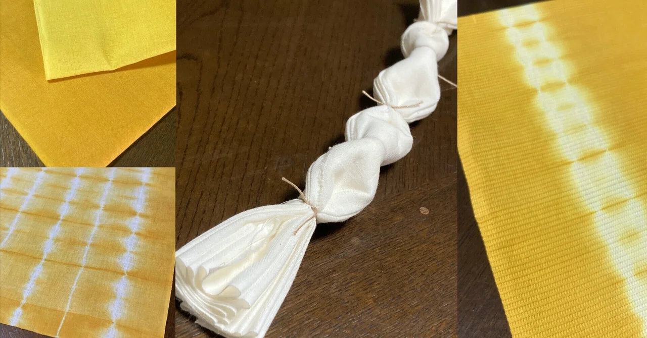
Experiment on a small square before dyeing yardage. Try folding and binding the cloth so some areas stay pale while the exposed parts take on yellow. Once the sample is dry, look at the repeat from across the room. Put one sample beside framed fabric art to compare the two patterns.
5. Make a Small Palette Before Dyeing Yardage
Test related plant colors on pieces cut from the same cloth. Give each piece a label and lay the dried results beside one another instead of judging them in the bath. If the palette feels busy, take one swatch away and see how the remaining shades work as a group.
6. Use Onion-Skin Colors for an Amber Story
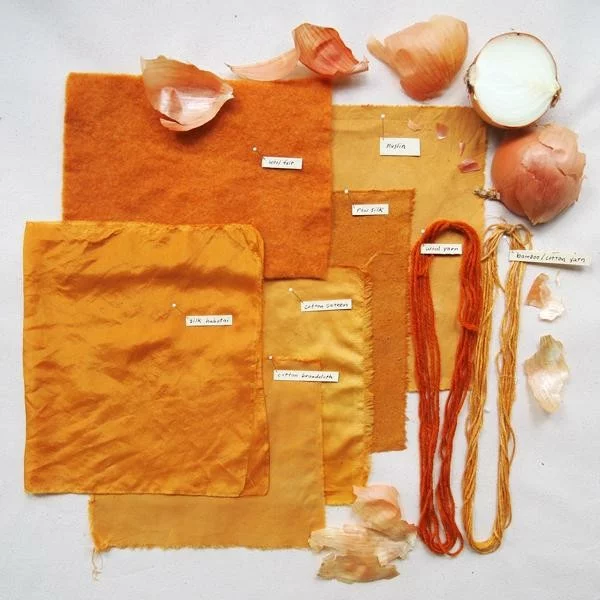
Compare several warm amber pieces on plain wood or against a cream backing. Distinct fabric weaves can make colors look deeper or lighter, so include the same type of cloth you plan to use later. Keep a small dried sample as a record rather than relying on a photo alone.
7. Arrange Swatches in a Fabric Color Arc
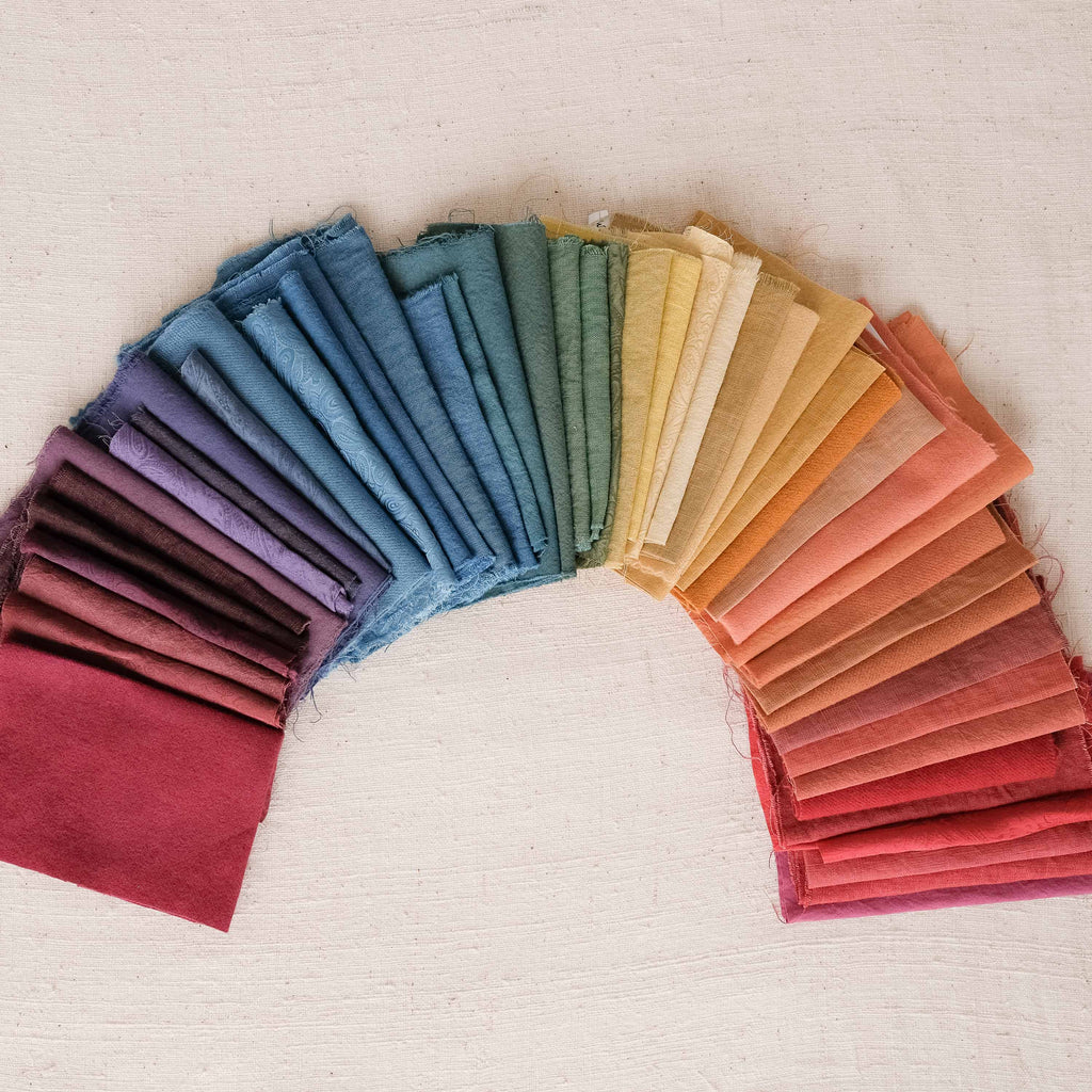
Use small cuts from earlier experiments to build a color study around yellow, pink, green, and blue. Leave a little space between neighboring swatches to reveal their differences. When two colors are very close, put a pale neutral between them to make each tone easier to see from across the room.
8. Compare Blue, Green, and Lilac Dye Samples

Lay blue, green, and lilac swatches side by side so you can read the small color differences. Keep the fiber and cloth weight consistent if you want to compare one dye variable. Once the samples dry, keep the record beside them so you can revisit the colors during a larger project.
9. Build a Small Palette of Muted Colors

Compare warm orange against blue and gray on the same table. Use the dried swatches to decide which color should lead and which belongs in a smaller accent. Keep your source notes with the fabric so you can separate the effect of dye preparation from changes in the cloth itself. Try the same muted shades around a dried flower centerpiece.
10. Compare Two Indigo Blues along an Edge
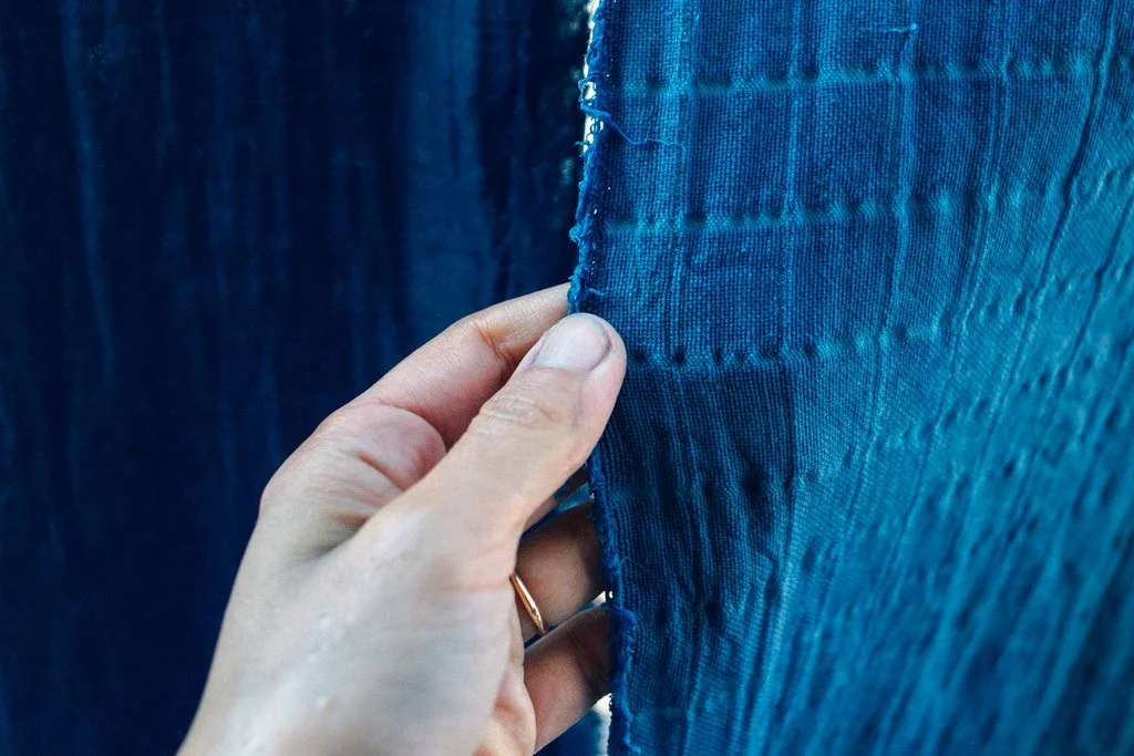
Put a deep indigo sample beside a brighter blue to see how the two shades read at their shared edge. Use the same material for both swatches so the weave does not change the comparison. Start with a narrow band of the stronger color and check the balance once the cloth has dried.
11. Set Up a Small Shade Comparison
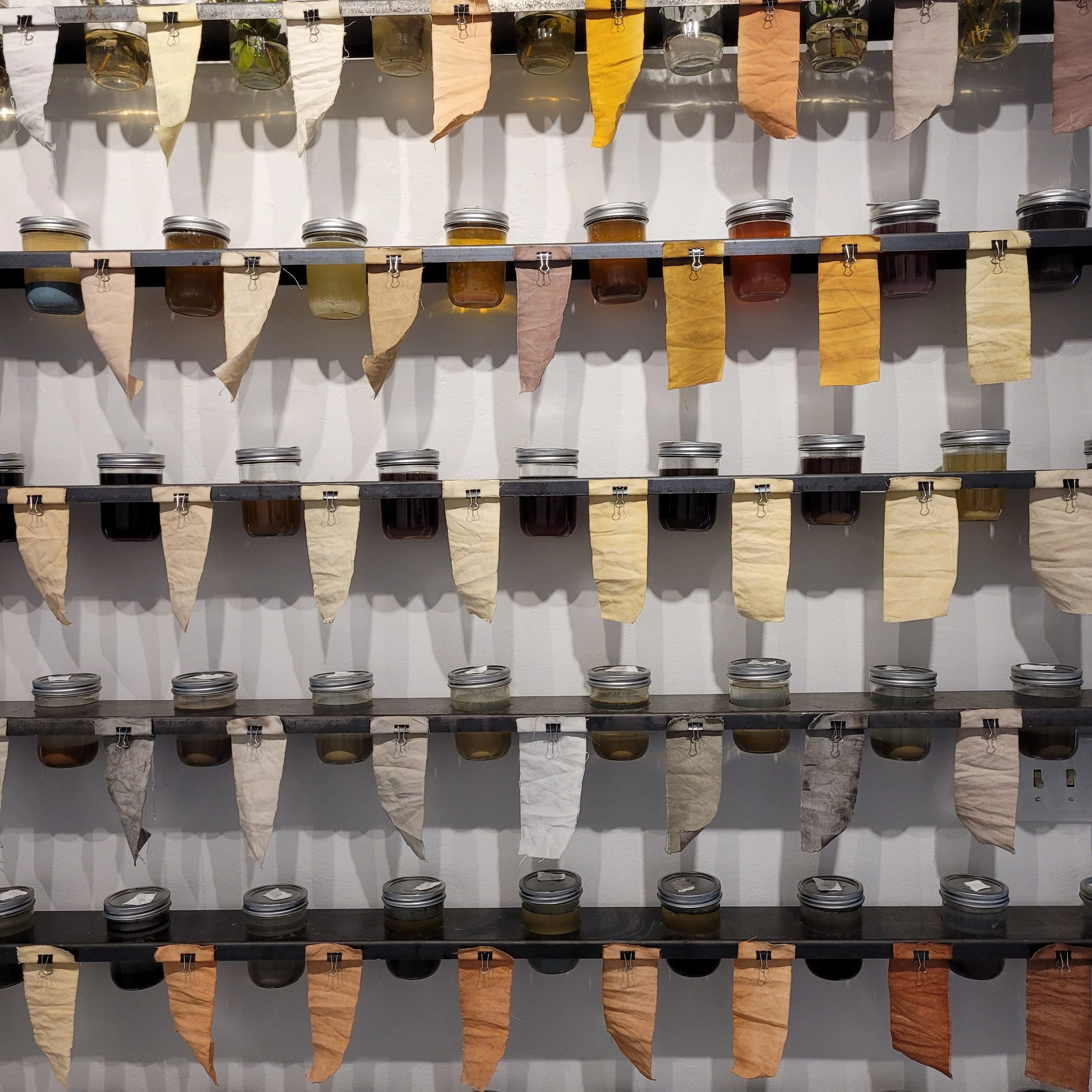
Use a few equally sized swatches when comparing sources or shades. Write the variables down before placing the fabric in a bath and compare the dried pieces against the same background. A simple side-by-side display helps you pick one result for a textile project without assuming the wet color will stay the same.
12. Make a Yellow Sample for a Simple Border

A plain yellow sample is useful when the end project needs a narrow border or a single color accent. Look at the dried cloth alongside the base fabric before choosing its width. A small yellow edge can tie in a repeat color without taking attention from the pattern in the middle.
13. Stack Warm Tones in Descending Intensity

Arrange yellow, rusty orange and pink from light to dark and turn the stack toward a window to check the colors. If one cloth gives a much stronger result, use it in a smaller role. You can reuse the group as a reference when choosing a runner, small pouch, or fabric panel.
14. Compare Shades Along a Green Gradient

Put the green samples on an off-white surface where you can see the differences between olive and deeper blue-green tones. Keep each swatch wide enough to see its weave. Use two neighboring tones for a quiet look or choose more contrast when you want the fabric bands to be distinct.
15. Compare Marigold Golds on Draped Fabric
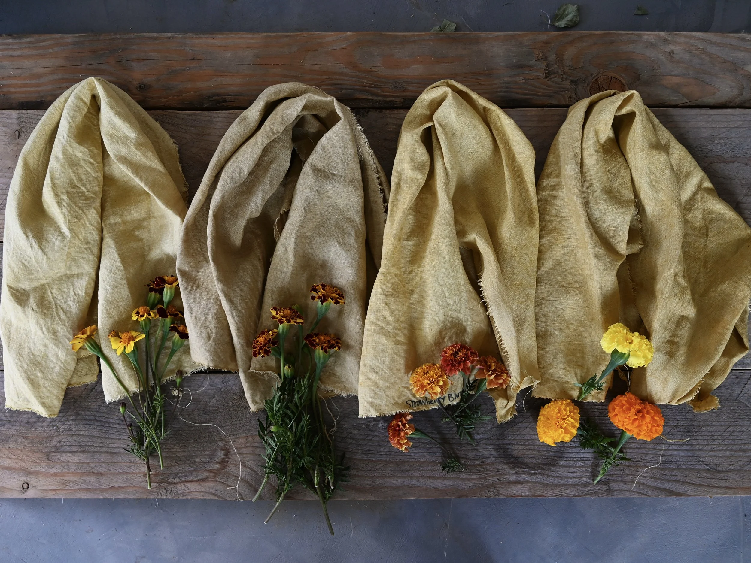
A deep golden textile can work on a simple draped display where folds create their own shadows. Try one short length first and hold it in the intended room. If the color is already strong, keep the nearby objects plain so their shapes and the fabric’s texture can be seen. Compare the soft light in hygge living rooms.
16. Let Pale Flowers Carry the Pattern

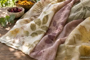
Scatter pale yellow and muted flower colors across a light cloth and leave room between prints so the leaf and petal shapes show. Try a small section first to see how much detail survives on your chosen weave. Give the finished piece a plain backing and keep a labeled offcut for comparison.
17. Compare Warm Pink Samples on Different Fabrics

Set out equal pieces of different fabrics and compare the pale pink and beige tones after the dye dries. A white backing makes faint differences easier to see. Label each piece with its fiber and preparation so you can tell which fabric gave you the shade you want to repeat.
18. Scatter Botanical Color Across a Bundle Print

Leave open cloth around the scattered marks so each patch of color has room to show. Try clustering a few darker prints near one edge while keeping the opposite edge mostly plain. Start with a sample using the same fabric you plan to display. Save it beside a note about the plant material and the preparation you used.
Put Your Dye Swatches to Work
Bring the dried swatches to the spot where you’ll use them before deciding which colors belong together. A shade that looks quiet on the worktable can stand out against a white frame or in afternoon light. The projects below show how to give a small textile sample a place in a room and echo its color in nearby objects.
- Framed Wall Art from Fabric Samples
- Dried Flowers in a Reused Tin
- Hygge Living Rooms with Gentle Lighting
- Staircase Photo Walls for Family Memories
Pick a shade you’d like to get from a plant and tell us what fabric you’d sample in the comments. If you’ve already done a dye test, share which color surprised you once the swatch dried.










0 Comments