21 Peel-and-Stick Kitchen Backsplash Ideas with Color and Pattern
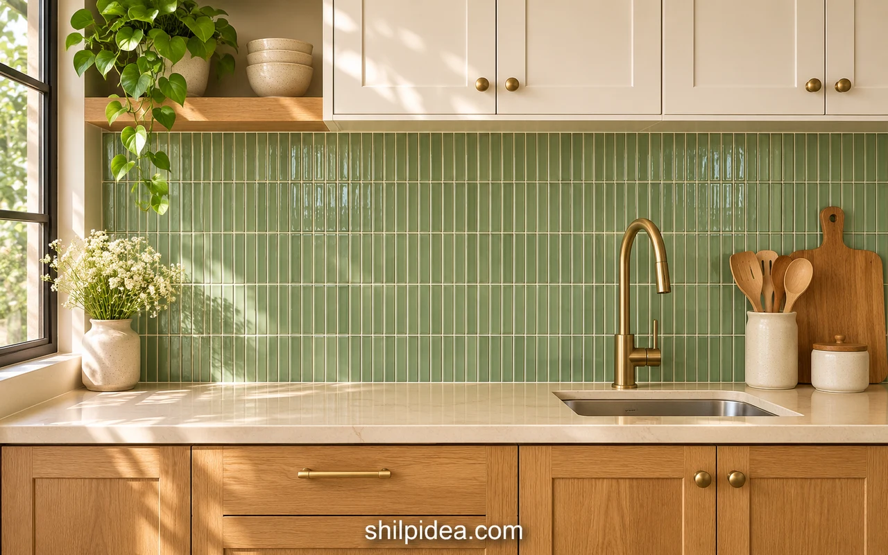
Peel-and-stick kitchen backsplash ideas range from quiet white rectangles to bold checks and decorative mosaics. The right choice depends as much on cabinet lines, countertop pattern and available light as it does on a favorite color.
Use these 21 references to compare pattern size, finish and placement. These interior design ideas can help connect the backsplash with the rest of your home.
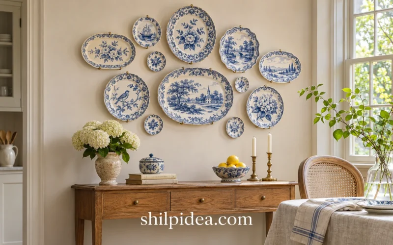
Each image links to its original product source. Keep a separate plate wall display away from the busiest pattern so both details have room to stand out.
1. Classic White Subway Behind Shaker Cabinets

White subway-style sheets give paneled cabinets a clean background without introducing another strong pattern. The staggered joints add just enough movement to keep an all-white kitchen from looking flat. Compare the tile white with the cabinet finish in daylight before committing. A slightly different undertone is often more noticeable across a long backsplash than it is on a small product photo.
2. Extra-Large White Tiles in an Open Kitchen

Larger rectangular units create fewer visible divisions, useful when the kitchen shares space with a dining or living area. This example keeps the backsplash quiet beside warm wood and dark pendant lights. Check the actual tile dimensions against the distance between your countertop and upper cabinets. Avoid choosing a scale that leaves only awkward narrow strips along the top edge.
3. Vertical White Stacks Beneath Open Shelves

Turning the visual emphasis upward can help a low backsplash feel taller. Here, pale stacked rectangles sit below long wood shelves, with plants and dishes providing the color. Keep the shelf contents edited so the subtle pattern remains visible. If adding storage nearby, these wall shelf ideas can help you plan the display separately from the adhesive wall finish.
4. Black Stacked Tiles with a Clear White Grid

Black rectangles and pale joint lines make a graphic background around a light countertop. The straight grid feels different from a staggered subway pattern, so check which direction suits your cabinet lines. The image is a product styling reference rather than an installation guide. Use the manufacturer’s current directions for seams and wet-edge treatment instead of copying details you cannot confirm from the photograph.
5. A Half-Height Black Chevron Band

A dark chevron band gives the wall direction without carrying a strong finish all the way to the ceiling. In this example, the lighter wall above keeps the composition open. Mark the proposed top line with removable tape before ordering. Check how that line meets windows, cabinet ends and any open shelving; a clear stopping point is part of the design.
6. Burgundy Checkerboard in a Defined Alcove

Large contrasting checks suit a defined kitchen zone where the pattern has clear boundaries. Cream cabinetry helps this burgundy-and-white arrangement feel connected rather than isolated. Test the full repeat on paper, not just a single square. Around a cooking appliance, the required clearances and any protective panel must come from the appliance and backsplash manufacturers, regardless of what a styled product image shows.
7. Narrow Burgundy Tiles Framed by Pale Cabinets

A tall, tightly repeated pattern can turn the space between pale cabinets into a deliberate focal panel. The wine-colored finish gives the layout depth while the simple doors keep the surrounding area calm. Keep countertop accessories limited to a few useful pieces. If you want handmade accents elsewhere, painted wooden spoons can repeat a small color detail without adding another large wall pattern.
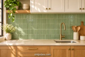
8. Mottled Green Squares with Dark Wood

Variegated green squares bring the appearance of depth to a kitchen with darker wood. The changing tones keep a broad surface from reading as a single flat block of color. Compare several sheets together before deciding where the strongest dark patches should fall. This is a zellige-inspired adhesive finish; do not assume that its material or installation method matches individual ceramic tiles.
9. Earthy Ochre Around a Coffee Station

A warm ochre backsplash gives a coffee corner its own identity while still working with muted cabinetry and wood. The earthy tone makes a small appliance area feel intentional. Check your chosen product’s clearance from hot countertop appliances, including steam outlets, before setting up the station. Leave enough working counter space that a coffee machine can be used without rubbing against the wall finish.
10. Marble-Look Shapes with Small Dark Diamonds

Small dark diamond accents break up a pale marble-look field and give a compact counter a more decorative background. The pattern has enough structure to work with simple cabinet fronts. Keep neighboring surfaces plain if your countertop already has strong veining. Ask for a sample or close-up when possible so you can judge the printed detail and surface relief at normal viewing distance.
11. A Soft Vintage Motif Around the Window

A small floral-and-geometric repeat can soften the hard lines around a kitchen window. This muted palette works with a wood frame and pale sink, letting the pattern become part of the room rather than a separate feature. Check how the design will meet the window trim before fitting sheets. Keep a few complete motifs visible instead of ending every edge with a thin fragment.
12. Tiny Multicolor Squares with Wood Cabinets

A fine mosaic introduces several colors at once, useful when you want to connect existing wood, countertop and accessory tones. Choose one or two shades from the mosaic for the rest of the room rather than repeating all of them. A small sample is especially useful here: many tiny squares can look much busier across a full wall than they do in a close-up.
13. Blue Decorative Tiles as the Main Pattern

A blue-and-white decorative repeat can do most of the visual work in a simple kitchen. Plain counters and a few wood accessories let the individual motifs remain readable. Plan the panel around complete repeats and check the meeting point at inside corners. This direction works best when nearby fabrics, floor patterns and display pieces leave the backsplash enough space to stand out.
14. White Hexagons for a Compact Pattern Field

A hexagon changes the outline of the pattern without needing strong color. This product close-up shows how pale cells and darker borders define the geometry; it is not a photographed kitchen installation. Use the actual sheet measurements to test the repeat behind your counter. Pay particular attention to exposed edges, where an uneven honeycomb outline may need the manufacturer’s recommended trim.
15. A Metallic-Look Mosaic at a Bright Sink

Light and dark brick-like pieces add a little shine beside a window while keeping a mostly neutral palette. The reflective effect works with a metal faucet, but it can also reflect clutter on the countertop. Keep the immediate sink area practical and easy to wipe. Check the listed material rather than assuming that a metallic-looking adhesive sheet is made from solid metal.
16. Fine Horizontal Strips Beneath Dark Cabinets

Small horizontal pieces can make a short counter run feel connected from end to end. In this reference, a pale mosaic lightens the band beneath dark cabinets. Keep the layout level and preview the joins between complete sheets; a repeating sheet seam can become more obvious than the tiny individual pieces. Use the product’s intended overlap or interlock instead of adding real grout by default.
17. A Gray Marble-Look Mix with White Cabinets

Several gray values create a middle ground between white cabinet doors and stainless appliances. The short mixed rectangles bring movement without a large decorative motif. Match the overall warmth or coolness to your countertop, then keep the pattern scale in proportion to the room. Nearby warm white walls can soften a mostly gray scheme when the undertones work together.
18. Speckled Gray Strips Around a Sink

A speckled or terrazzo-look finish adds fine detail when a plain backsplash feels too flat. Here, the narrow pieces wrap the wall behind the sink and connect with the warm cabinetry. Test the finish under the light you actually use in the evening. Strong under-cabinet lighting can emphasize every small mark and joint, making the surface look busier than it does in daylight.
19. Dark Mosaic with Pale Rectangular Accents

Larger pale rectangles interrupt a dark mosaic, creating a more graphic rhythm than an evenly mixed gray sheet. It can work as the main contrast in a kitchen with simple cabinets. Repeat one dark finish elsewhere, such as handles or a shelf bracket, then stop before the room becomes too coordinated. These wood shelf ideas offer texture for a separate storage area.
20. White Herringbone Under Glass-Front Cabinets

A white herringbone pattern adds directional detail while allowing glass-front cabinets and dark countertops to remain prominent. The diagonal arrangement needs careful planning at corners and along exposed edges. Compare a full-sheet layout before cutting so you understand the repeat. A styled image cannot establish appliance suitability; check the exact product and appliance instructions before using an adhesive finish near the cooking zone.
21. Textured White Blocks Behind a Beverage Shelf

A textured white surface gives open drinkware shelves a background without competing with their contents. This reference pairs the pale wall with slim warm-metal supports and a small beverage area. Texture may change how the surface catches light and collects dust, so inspect the real material and cleaning directions first. Add indoor plant displays nearby only where they leave the counter and shelving easy to use.
Check the Product Before Planning the Installation
These are design references, not interchangeable material specifications. Printed films, dimensional vinyl or gel sheets, metallic products and stone veneers can require different cutting, preparation and edge treatment. Read the current directions for the exact product, test an inconspicuous area and confirm landlord approval where relevant. Removal may lift paint or wallpaper; “peel-and-stick” does not guarantee a damage-free rental upgrade.
Check surface preparation, paint-curing time, seam treatment and required clearance from ranges, steam outlets and countertop appliances. Smart Tiles’ current guidance explains its own surface and heat requirements, while Tic Tac Tiles’ instructions distinguish water resistance from continuous water exposure and discuss removal risks. Follow the stricter applicable appliance and wall-covering requirements; a product photograph does not override them.
Measure each wall section and plan cuts around trim and outlets before ordering. Keep electrical work outside a decorative surface refresh; do not cover receptacles or improvise changes to electrical fittings. Use a qualified electrician whenever the thickness or layout requires electrical adjustments.
Connect the Backsplash with Your Kitchen’s Other Details
Once the backsplash is chosen, look at the surrounding wall color, shelves and small decorative pieces together. A strong pattern often needs a quieter display nearby, while a plain finish can support a few handmade accents. Keep the main preparation area clear and use the adjoining dining wall for decorative pieces that do not belong beside the sink or stove. These ideas can help with that next decision.
- Decorative Plate Displays for Kitchen Walls
- Wooden Crate and Pallet Storage Shelves
- Painted Wooden Spoons for Kitchen Displays
- Warm Accents for Eggshell White Walls
- Wall Shelves and Plant Display Ideas
Would you choose a quiet tile-look finish or make the backsplash your kitchen’s main pattern? Share your room colors and favorite direction in the comments. If you have already tried an adhesive backsplash, tell us what helped with planning, fitting or caring for it.






















0 Comments