22 Kitchen Design Ideas with Inviting Colors and Finishes
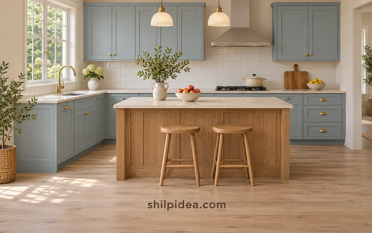
Kitchen design ideas become easier to compare when you look at color and finish together. A blue cabinet, warm wood surface, or quiet cream wall changes the feeling of the whole room, not just one corner.
Start with the elements you plan to keep. Our kitchen backsplash ideas offer another way to connect walls and cabinets.
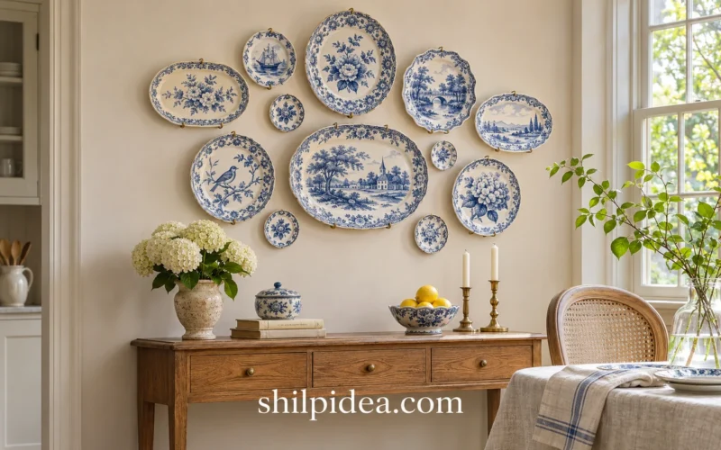
Then choose the accents that make the space feel personal. These plate wall displays show how a decorative detail can support an overall palette.
1. Warm White Cabinets with an Olive Backdrop
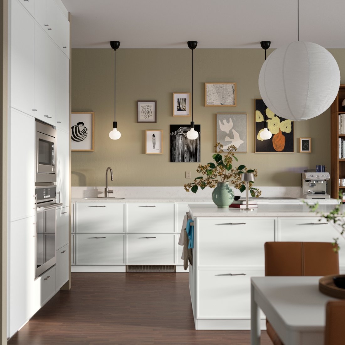
White cabinetry does not have to sit against a white wall. An olive backdrop gives these pale fronts a warmer, more settled feeling while keeping the working surfaces visually clear. Repeat the wall color in a small accessory if you want the room to feel connected. Our eggshell white ideas offer more ways to balance pale finishes with character.
2. Deep Green Cabinets in a Compact Room

A rich green can give a small kitchen definition without requiring several competing colors. In this narrow setting, the cabinet fronts become the main feature, with lighter surfaces and simple pendants providing contrast. Compare a real door sample with your floor and countertop before committing. The same green can feel quite different beside a cool gray surface and a warm cream one, especially as daylight changes.
3. Soft Gray for a Low-Contrast Finish
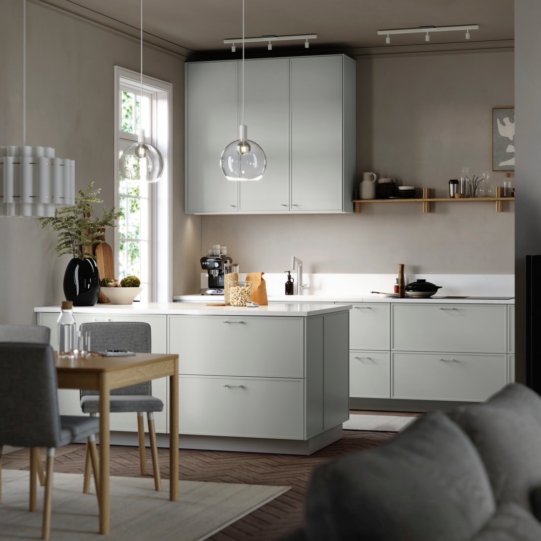
Soft gray cabinetry creates a quieter transition between cabinets, walls, and an adjoining living area. The island here belongs to the same palette, so the room reads as a connected whole. This approach suits someone who wants shape and storage to lead the design. Add interest through a distinct countertop texture, clear lighting, or a few warm wood details rather than choosing another strong cabinet color.
4. White Country Cabinets Beneath Dark Beams
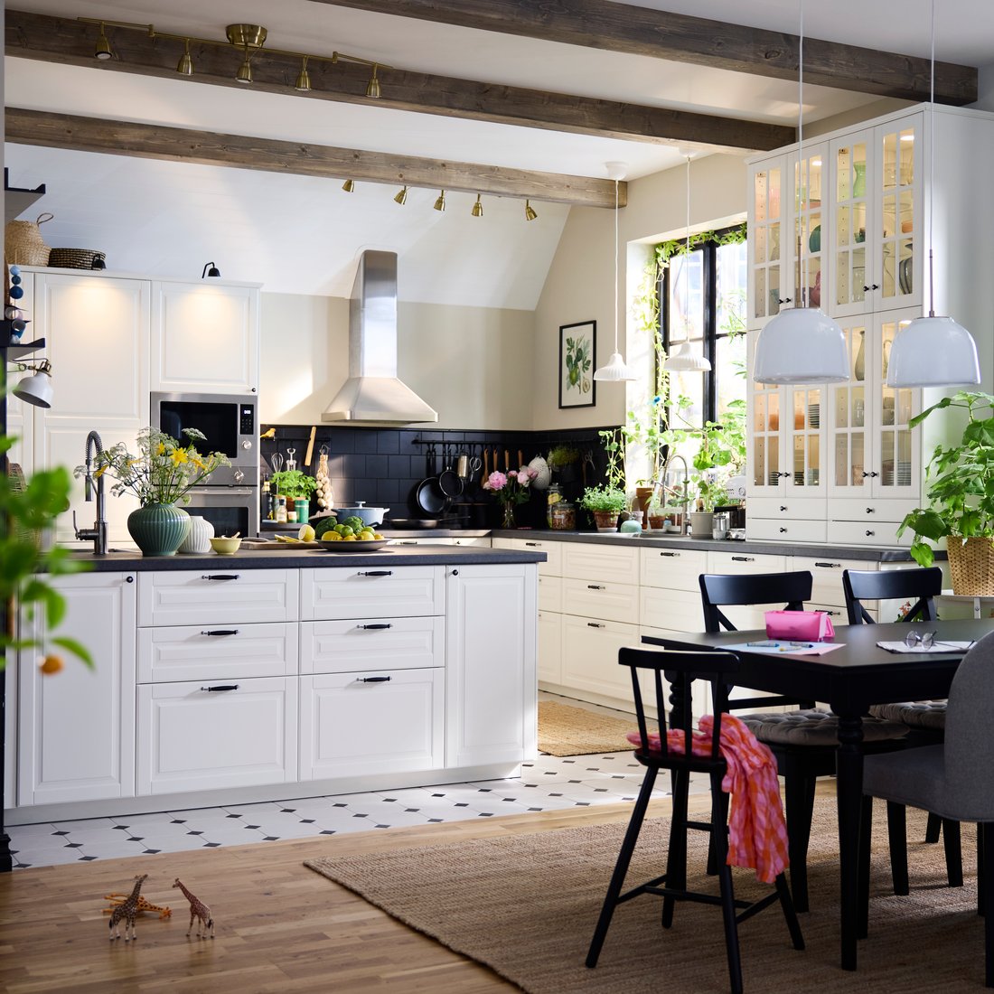
Dark ceiling beams can give white kitchen cabinets a more grounded setting. The contrast works because the cabinet fronts remain simple enough to sit beside the architectural detail. A wood floor and a dining table carry the warmth through the room. If your home already has a strong beam or exposed timber feature, compare cabinet samples against it instead of choosing finishes in isolation. Existing wood can be the starting point for the entire palette.
5. Sage Walls with Light Open Storage

A pale green wall can bring color to a kitchen while keeping the cabinets neutral. White shelves and light fronts keep this compact room from becoming visually heavy. The wall treatment is doing much of the decorative work, so everyday dishes can remain simple. Use an actual painted sample near both the window and the darkest corner; a shade that feels fresh in daylight may look grayer under evening bulbs.
6. Powder Blue on a Glass-Front Cabinet
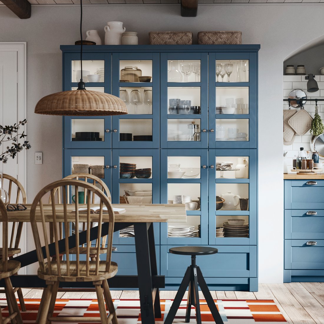
A tall blue cabinet gives this kitchen a clear focal point, especially where the glass doors reveal neatly grouped tableware. The color becomes part of the room’s architecture rather than a small decorative accent. Keep the items behind the glass related in tone if you want the frame color to stand out. Before choosing extensive glazed storage, consider which shelves you are comfortable keeping on view during ordinary use.
7. Honey-Toned Wood in a Sunny Kitchen
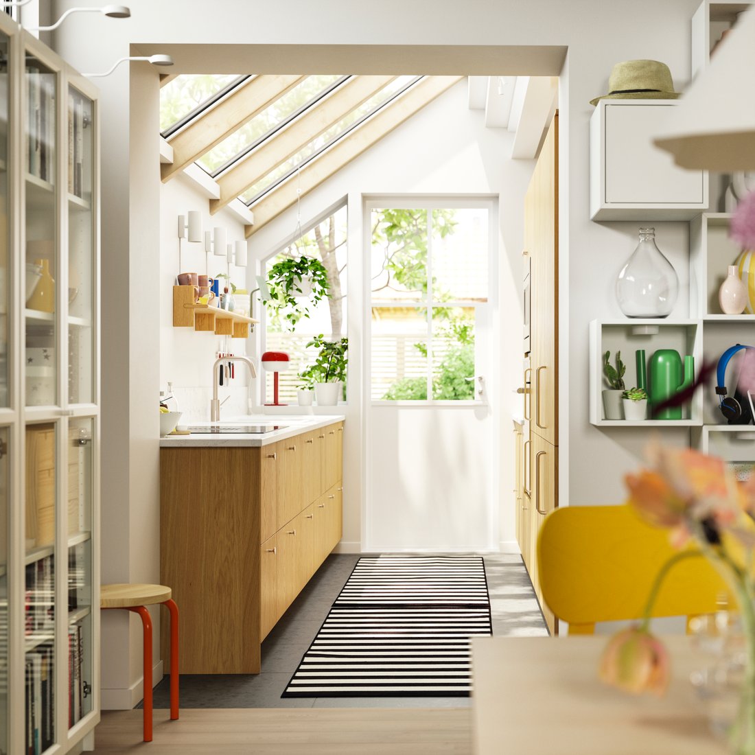
Warm wood fronts sit comfortably in a sunlit room with plenty of pale surfaces around them. The wood gives the kitchen a useful connection to dining furniture and other natural textures. Check the direction and scale of the grain across several doors, not just on one small sample. A long cabinet run can look busier than expected when a strongly patterned grain repeats across every drawer and panel.
8. White Glass-Front Doors for a Lighter Upper Run
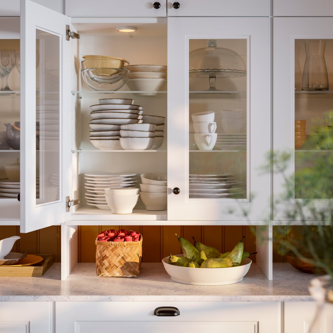
Glass-front upper cabinets break up a long area of solid doors. In this example, white frames keep the display gentle while stacked dishes add texture. Think of the visible shelves as part of the finish scheme: a small range of dish colors can feel calmer than many unrelated objects. For nearby open storage, these crate shelf ideas offer a different texture to consider.
9. A Blush Accent Above White Cabinets
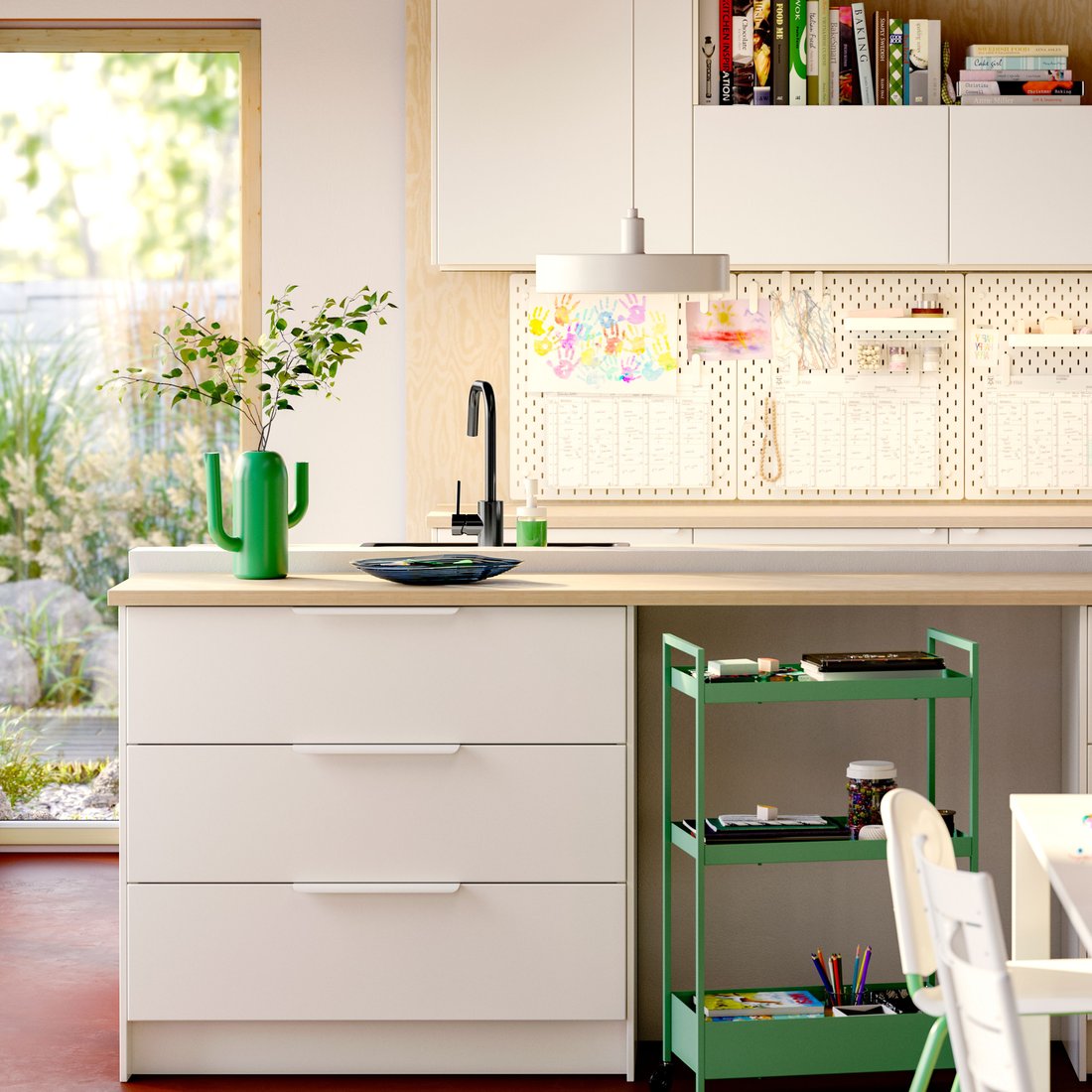
A soft pink section of wall can warm a white kitchen without turning every surface into a color statement. The wood-toned counter provides another gentle contrast, while the white cabinetry keeps the room connected. Choose a pink with the right undertone for your existing floor and worktop. A peach-leaning shade and a dusty rose can create noticeably different results even when both appear pale on a paint card.
10. Pale Wood Fronts with a White Counter

Pale wood lower fronts make a practical-looking kitchen feel warmer, while white surfaces maintain a clear overall outline. The visible grain adds character without needing a patterned backsplash. To adapt the idea, choose whether wood will be the main material or a supporting accent. Repeating it in every shelf, chair, and accessory can reduce the contrast that makes the combination appealing. Leave some surfaces plain so the cabinetry has room to stand out.
11. Charcoal Cabinets Beside a Warm Neutral Wall
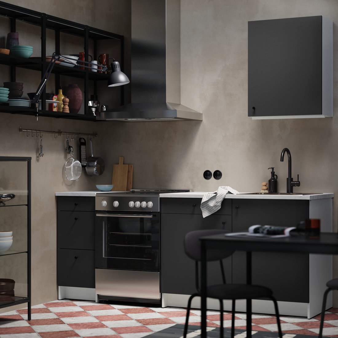
Charcoal cabinet fronts can feel inviting when the surrounding wall has a warmer, softer tone. Dark open shelves continue the cabinetry’s outline, while lighter objects prevent the display from becoming a solid block. This is a useful combination to test in a kitchen with limited daylight. Compare samples under your actual evening lighting and consider how fingerprints, dust, and everyday splashes show on the proposed surface before choosing the finish.
12. Glossy Greige with Dark Wood Above
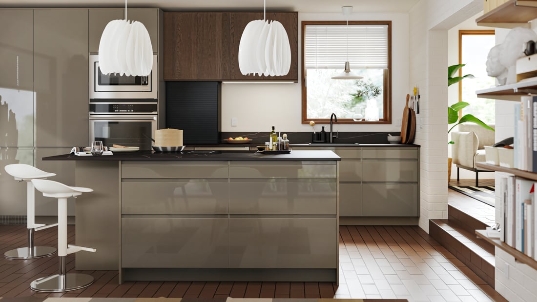
Glossy greige fronts bring a little reflected light to a kitchen that also includes darker wood. The two finishes do different jobs: one looks smooth and continuous, while the other adds depth. Limit the remaining palette so the contrast feels deliberate. Before ordering glossy doors, examine a sample at different angles and try wiping it with the recommended cleaner. Appearance in a showroom photograph does not tell you how a finish will behave in your own light.
13. Cream Cabinets with Small Black Details

Cream cabinetry can create a softer starting point than bright white, especially beside a wood counter. Small black details sharpen the room without dominating it. The compact arrangement here shows how a limited palette can work in a modest footprint. Choose the dark accents as a group—lighting, handles, or a small appliance—rather than introducing several different metal finishes by accident. Keep useful counter space clear as you add accessories.
14. Olive Green in a Farmhouse Setting

Olive cabinets and pale work surfaces give this farmhouse-style room an earthy balance. Woven pendant shades and wood details add softness without changing the main color relationship. If you like the greenery in the setting, our indoor plant displays offer placement inspiration. Choose any plant for the actual light available and keep foliage clear of cooking heat and the surfaces you need for food preparation.
15. Fluted Wood Against Matte Black
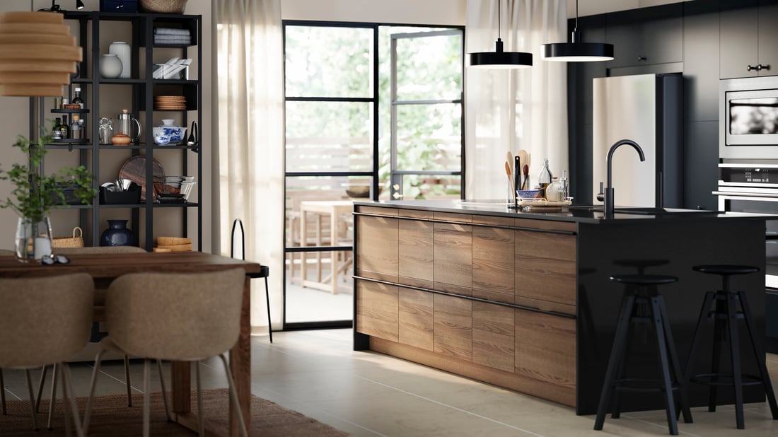
Vertical wood texture gives a dark kitchen something tactile to focus on. Here, the warm island front stands apart from the matte black units, creating contrast through both material and color. A close sample matters: deep grooves and fine ridges can look quite different from across the room. Consider the cleaning method and the exposed edges before choosing a textured front for a busy island or a surface that receives frequent splashes.
16. Blue Seating as a Changeable Accent

You can introduce a stronger color through furniture rather than through every cabinet door. Blue chairs give this pale gray kitchen a playful focal point while leaving the main fitted elements restrained. This is useful if you enjoy changing accessories over time. Repeat the blue only where it supports the room, perhaps in one small object, and check that the chairs still tuck away comfortably without interrupting the main walking route.
17. A Black Hood in an Otherwise White Kitchen

A black extractor hood creates a clear focal point against white cabinetry and a pale tiled wall. Dark window or doorway details can help it feel connected to the room. The combination does not need a dark countertop to work; a lighter work surface keeps another large area visually quiet. When planning a hood, follow the appliance and ventilation requirements first, then assess its shape and finish as part of the cabinet composition.
18. Sage Cabinets with a Fine Tile Grid
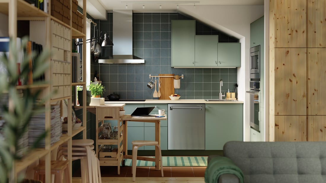
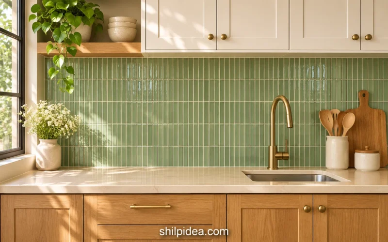
A small tile grid adds structure behind the soft green fronts in this kitchen. The pattern stays restrained because the tiles and grout sit within a similar tonal range. This is a useful approach when you want texture rather than a bold decorative motif. Compare the grout color with a full tile sample board. A strongly contrasting grout can make the same tile arrangement feel much busier than the subtle version shown here.
19. Glossy White Around a Long Window
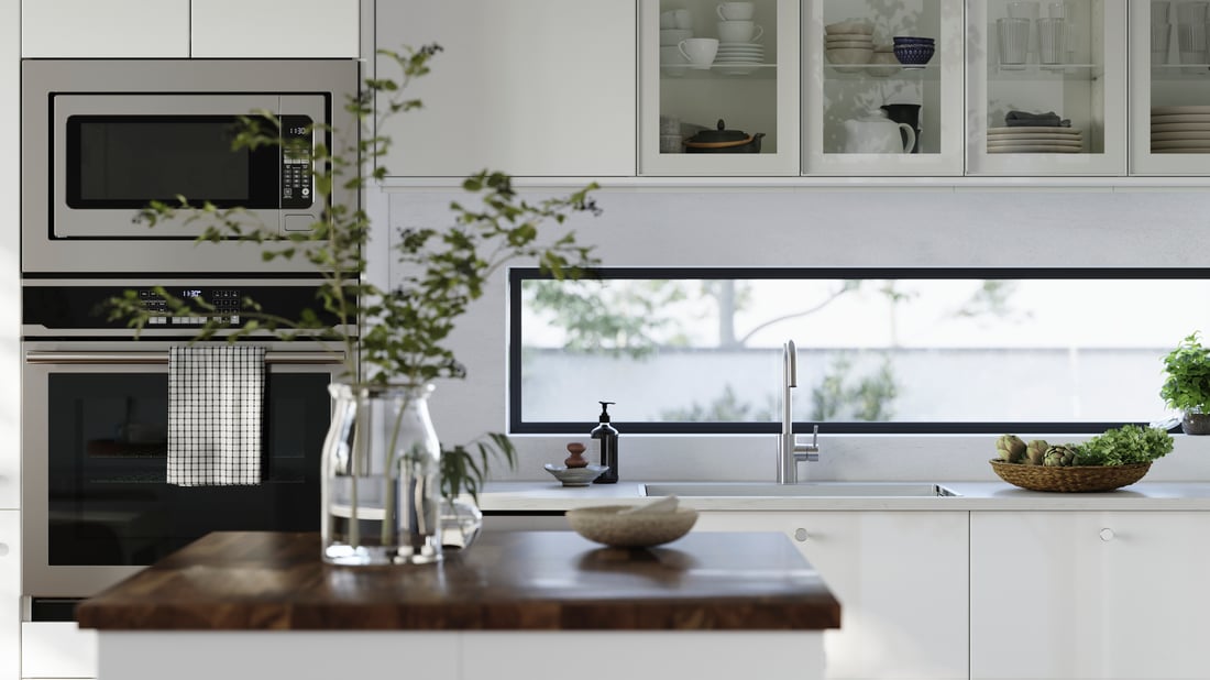
Glossy white fronts and glass storage sit around a long, narrow window in this bright kitchen. The view and natural light supply much of the visual variation. Keep the worktop arrangement simple so it does not compete with that horizontal line. If you are adapting the idea, study reflections from both daylight and fittings at night. A reflective surface can reveal neighboring colors and objects that are easy to miss when viewing a small sample.
20. Dusty Pink Walls Under a Sloped Ceiling
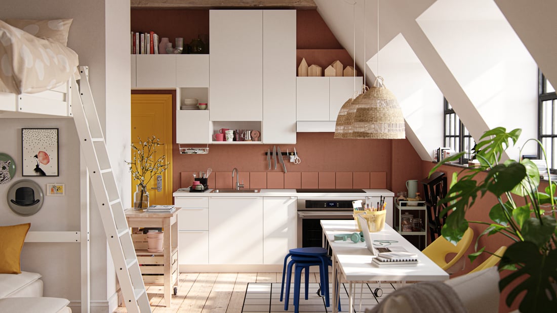
A muted pink backdrop can turn an awkward ceiling shape into part of the kitchen’s character. White cabinetry provides a clear counterpoint, while wood and woven details make the room feel connected. Let the largest wall area establish the color rather than scattering several equally strong accents. Our interior design ideas offer more ways to plan around a room’s existing proportions.
21. Smooth Pale Wood for a Calm Modern Finish

Smooth, light wood fronts create a different effect from the fluted island earlier in the collection. The broad, uninterrupted surfaces let the grain become a gentle background rather than a strong pattern. Pale walls and a simple counter continue that calm direction. Check how adjacent panels meet and how the finish looks at corners. A minimal design depends on those transitions because there are fewer decorative details to draw attention elsewhere.
22. Natural Wood with Visible Ceiling Timber
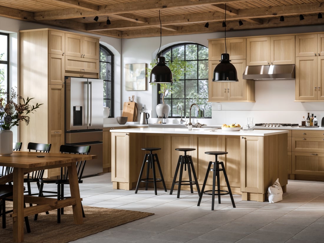
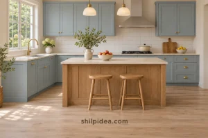
Wood cabinet fronts and visible ceiling timber give this room several layers of natural texture. A pale counter and simple dark stools keep the wood from becoming the only visual note. You do not need every timber to match exactly, but the undertones should sit comfortably together. Lay cabinet, flooring, and countertop samples side by side in the room, and compare them again in evening light before choosing the final combination.
Bring Your Kitchen Palette Together
Choose one main cabinet finish, one supporting surface, and a small group of accents before adding more choices. Compare physical samples in your own kitchen so the result suits its light and existing materials. These collections offer further ideas for walls, displays, and useful decorative details as you narrow the combinations that feel right for your home.
- Kitchen Backsplashes with Color and Pattern
- Decorative Plate Walls for Kitchens
- Eggshell White Walls with Warm Accents
- Interior Design Ideas for Inviting Rooms
- Indoor Plant Displays for Your Home
- Painted Wooden Spoons for Kitchen Decor
Which combination would you bring into your kitchen: muted color, natural wood, or a lighter neutral finish? Share your palette plans in the comments. If you have already changed your kitchen’s colors, tell us which pairing felt best in everyday light.












0 Comments